16 May 2019
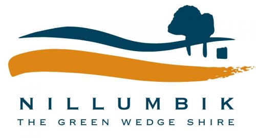
The current branding/logo for the Nillumbik Shire Council was designed in 1995 for the new municipality, following local government restructure.
At the launch of this logo the commissioners, then in charge of Nillumbik, stated:
‘The design represents the communities that comprise Nillumbik and reflects the community’s commitment to the environment and heritage of the area.
The corporate identity uses the landscape of Nillumbik to reflect the environmental focus of the Shire whilst retaining urban and rural elements working in harmony with the undulating hills. Using the landscape results in people identifying immediately with the logo. The familiar range of hills speaks not only of our surrounds but of the concern the members of the local community feel for the environment.
The sweeping stroke of the land beneath the hills and trees emphasises the length of the horizon line and brings subtle reference to the aboriginal meaning of Nillumbik ‘shallow earth’. The square block nestled comfortably within the landscape represents the urban element working in harmony with the environment, as the square could be a window, a house or a farm.
The artistic heritage of the Shire is of great importance and a brushstroke has been used for the sweep of the land, to reinforce the value of the arts and culture of Nillumbik.’
The commissioners also stated:
‘The colours have been chosen keeping in mind the hues of the natural landscape, the ochres and distant blue/green of the hills. The colours work together in the logo to speak clearly against a backdrop of urban, rural and bushland environments.’

A community elected council later added the words ‘The Green Wedge Shire’ to the logo.
This corporate identity was designed by Anna Wilson, in consultation with a public advisory group and shire staff. Anna is now known as Anna Walker and is the daughter of Michael Wilson (Eltham creative goldsmith/jeweller) and Wendy Wilson.
Anna is now a nationally and internationally known illustrator and author of children’s books, many of which have either been shortlisted for awards or have won awards. Her latest book ‘Florette’ was selected as a New York Times/New York Public Library Best Illustrated Children’s Book for 2018. Among other recent
recognitions she also won the 2018 Wilderness Society Environment Award for Children’s Literature.
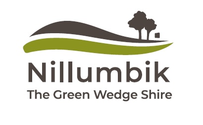
 Nillumbik Shire Council now proposes to ‘refresh’ the current logo by changing the colours from ‘blue and orange as the master brand to colours that reflect the actual landscape in the Shire’ and to streamline the sweeping brushstrokes in the logo to create strength and harmony and so refine the key elements of the original in a contemporary way.
It has stated that the tagline “The Green Wedge Shire” will appear in uses of the logo when the size of the font is large enough to be legible and not take away from the core logo identity.
Council has also stated
‘The current Council and Council Plan signalled significant change for the organisation and the community. A refreshed logo and brand elements will go a long way in reinforcing this new paradigm and signal an innovative, professional modern approach to business and corporate reputation.’
This proposal intends to change the unique community based branding in use for nearly 25 years, designed by an internationally recognised illustrator, so as to introduce a very stylised corporate look that has been adopted by many local governments, which results in a blandness and sameness that lacks ‘soul’ and individual identity. The detail in the brushstroke will be lost. All this without any opportunity for our community to comment.
Why is this change required, what is driving it and how can it be justified?
Over 400 signs, extensive printed materials, business cards, uniforms, vehicle signage, website content, etc., will need to be altered.

This would be significant short and long term cost to the council (one councillor has mentioned a figure of $100,000) and therefore the community, when so many other identified needs are not being satisfied.
